As you are probably well aware, I’m a pretty big fan of marketing automation. And I am a firm believer that automation plays a massive role in an small business’s ability to scale.
But, along with the luxury of growing and scaling comes a handful of drawbacks. The fact of the matter is that people receive automated emails differently than they receive personal emails. They read them differently and they even respond to them differently (or not at all).
Think about the way you engage with your inbox. When an email was written to you by an actual person, you are exponentially more likely to respond than when you get a blog update, or newsletter, right?
Well, this reality also creates an opportunity. If you’re conditioning your prospects to expect one type of email from you (HTML, branded, newsletters, etc), then you have an opportunity to strategically deviate from that and capitalize on higher engagement.
One way to do this is be sending an automated email that appears to be a plain text personal email. I’m not saying to lie to anyone, I’m just saying that if you mix up the way you’re communicating you’ll experience a spike in engagement. This can be wildly effective if you sprinkle it into the middle of your nurture sequence, or your holiday promo campaign; try it.
You can use the HTML email builder (in a campaign or as a broadcast) and build an email that looks like a plain text email. Navigate to the email editor in a campaign sequence, in your templates section, or as a broadcast and follow these 9 steps to try it out:
-
- Write a subject line that you would actually write. That means, go to your sent folder of your actual email client, and look at the subject lines you actually use. For this particular email you should avoid “Top Banana Slicer Reviews of 2014” or whatever. Just write what you would write if you were emailing me go to go happy hour.
-
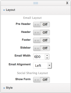
- Click on Layout & Style. Now on Layout. Turn Off the Header, Footer and PreHeader. And change the email alignment to Left.
-
- Click on Style, and select the style labeled Simple. This style should be preconfigured, what we’re going for is a black text email on a white background.
-
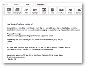
- Now write the body of the email. You can use a merge field for their first name, but remember to write it as if you were crafting a personal message to this person. Nothing extravagant. No frills. If you don’t usually use a fancy email signature, then don’t use one here. If you usually just paste a link in instead of putting it behind text, then do that.
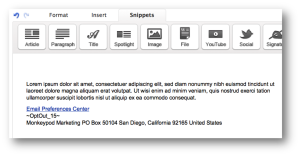
- Your email has to have an unsubscribe, but try this. Move the unsubscribe below the address block, and then add a divider above both of them.
-
- Send a test version of the email to yourself. This is a good habit to get into for any email you build. Occasionally emails will look different depending on where you’re viewing them.
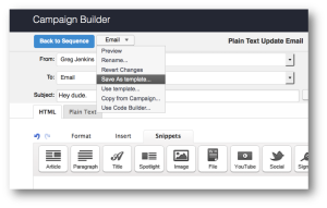
- Recommended: Save this email as a template for future use. If it’s a broadcast, you may need to send it to yourself, and then save it from the broadcast results page. If you built it in the template library, then you can skip this step.
So there you have it. 9 easy-to-follow steps and you’ve got yourself an email template that looks like one you personally wrote in outlook or gmail, or wherever you write emails.
Two things to note:
A. Yes, you can go so far as to add something to the footer like “Sent from my iPhone”; but personally I think that’s overkill, and maybe even borderline unethical. The way I’ve outlined it above doesn’t overtly claim that we’re actually writing it. But, I’ll leave that to everyone’s own discretion.
B. Most email clients track opens when images are loaded, so if your email doesn’t have any images, then it’ll be really hard for Infusionsoft (or any system) to accurately track opens. One thing you could do is include a small white or clear 1×1 pixel image to help with this. (EDIT: Infusionsoft should do this for you automatically. See comments.)Sending this email that doesn’t look like what they’re used to, at an irregular time, from a different address, will make it stand out. You can reasonably expect a higher engagement level, both in email opens as well as in replies and clicks.
All in all, this tactic is one way you can leverage pattern interrupt in your marketing to increase prospect engagement. It’s important to exercise this sparingly. In general I don’t think people mind automation, but that doesn’t mean we should beat them over the head with it. Thoughts?
Pro-tip: If you want to get rid of the default padding the email builder adds to the body of the email, you can turn the header back on (no forced padding there), and move all email elements up into the header section.



Even if there are no images, using the method you describe above, it will still add a 1×1 open tracking pixel 😉
Perf. Too easy.
Another great tip for this is merging in day of the week. You can start off by saying, “hope your [merge day of the week] is off to a great start,” or end with, “have a great [merge day of the week]!”