He covers a lot more in his post than I do here, but rather than wait until I felt confident taking the exact same approach, I figured I’d tackle what I could for now.
I spent a little time on my channel page, but most of my effort was focused on tidying up the following things for individual videos.
SEO for YouTube Checklist
- Update Video Title
- Update Video Description
- Update Video Tags
- Update Video Thumbnail
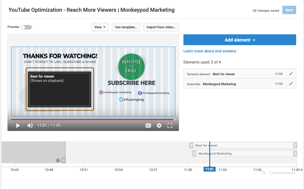
- Add End Screens
- Add Captions
I recorded a video summary of my approach on this project so you could see exactly what it takes – tackling all these items for a single video takes less than 10 minutes (with the bulk of the time being spent creating the thumbnail graphic).
Updating the video title, tags, and description were all pretty straightforward – and to be honest, I probably could still go back and make them even more strategic, but since this was something I had spent almost no time on in the past it was easy for me to make a significant improvement without a whole lot of effort.
I tried to answer “What is this video” and “Why is it valuable” and then “What would this person want after this” – then I used the description to answer as much of that as I could.
YouTube Thumbnails
Updating the thumbnails took a little more time, because I had to actually create the graphics. As you know I’m far from a graphic designer, but this post outlines my very amateur method for creating graphics.
Here are a few of the thumbnails I created for this project:
As you can see I chose bright colors (purples, oranges, blues, etc), and I avoided using the normal YouTube colors because I wanted to make the videos stand out from the rest of the YouTube platform interface.
In Matt’s post he gives 5 rules for his thumbnails:
1. Must include a human face that conveys an emotion
2. Colors must contrast AND stay on brand
3. Must include a pool or hot tub elements (this was for his Swim U brand)
4. No more than three words AND they can’t repeat the video title
5. Create separation with the use of drop shadows – no outlines
I didn’t follow his advice to a tee – but I used it as a guideline. I chose bright colors, I limited the text I used – and I tried to pick graphics that either represent Infusionsoft or the particular topic of that video.
But when it came to using a human face that conveys emotion, that was one of those things that I felt like would slow me down, so I decided to get version one out there and maybe I’ll do my own greenscreen photoshoot at some point when I’m ready to level up again.
If you’re interested, he did a video recap of his thumbnail design process here.
Adding End Screens
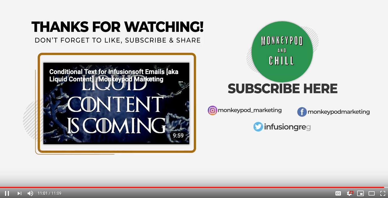
This one was totally new for me. End Screens are the little tiles that pop up at the end of a video to recommend another video, or to encourage the viewer to subscriber.
It’s a native YouTube feature, and it was easy to use – I just had never even tried.
So, for my end screens I mostly just added the subscribe button, and then either a) a video that was related to the topic or b) I used the “best for viewer” option to let YouTube guide them.
I started by just added these over the video itself and had to pick and choose where to place them because the videos I was retroactively updating hadn’t been created with that in mind – so in some instances, the tiles are over my face.
I figured long term I’d create a specific section that was designed for this purpose – and as I got into this I decided I’d better tackle it sooner than later. So, at the end of the video above you can see there is an outro animation designed to frame up both the recommended video as well as the subscribe button (thanks to Bret Martineau for whipping that up for me).
End Screens were much easier to add than I expected.
Sometimes I think I tell myself something is going to be harder than it actually is – which makes it easy to justify putting it off. Which brings me to captions…
Adding Captions
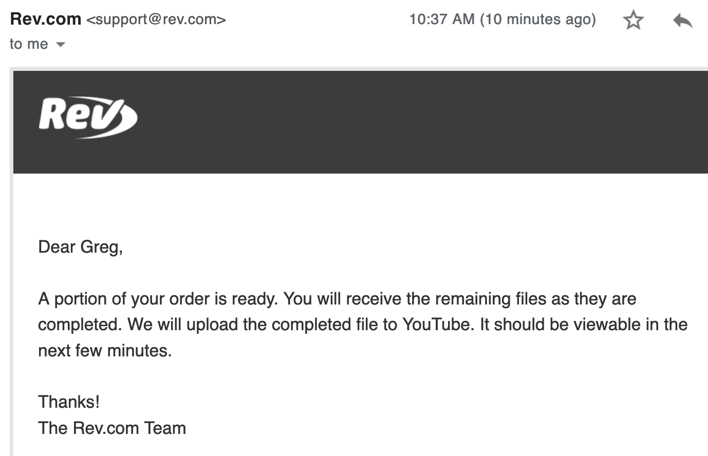
I had known about Rev.com as an option for getting videos transcribed and adding captions, heck I had even recommended it to others – but it took Matt’s experiment for me to actually try it out.
I thought it was going to be a “whole thing” – it was not.
Rev.com was stupid easy – a full-on delightful customer experience. In fact, just this morning I placed another order with them (my third) and as I type this the completion notifications are coming through.
I knew that captions would make it easier for people to watch videos when they’re somewhere and don’t want the audio on – like a waiting room or, ahem, somewhere more private.
But it always felt like a “nice-to-have”, what hadn’t occurred to me was that YouTube actually takes this into consideration when deciding which videos to show someone. That was all I needed to hear.
Oh, and they upload the captions right to your YouTube channel – so I literally select the videos I want them to transcribe, pay, and then I’m done. Stupid simple
So, there you have it – I’ve started optimizing SEO for my YouTube channel with the hopes of getting my content in front of those that it can help – and if you’ve got a YouTube channel of your own then I invite you to do the same.
Takeaway Lessons
YouTube rewards you if you help people stay on their platform – this was the big light bulb moment for me.
If you make it easy for people to keep watching videos, then YouTube will help people find your content.
Obviously I’m not done – I’ve only updated a few dozen of my videos, and there is plenty more I’d like to do – but I wanted to get the ball rolling so I can start experiencing whatever results my tweaks may have, rather than wait until I feel comfortable tackling everything on Matt’s list before I get started.
Progress > Perfection
If SEO for YouTube channels interests you then I strongly recommend digging into the full experiment over on his MoneyLab site, but before you do – go ahead and subscribe to my partially optimized YouTube channel here:


